I'd like some feedback on the new look HQ i have been working on with a graphic designer for a few days.. This is our near final design, it will of course have many more areas on the homepage to show off whats going on..
I hope you like the ideas i have. I still need to change up a few things, but after that i can begin the huge job of coding it. When i say coding, first i need to convert the PSD (photoshop) file into html/css. Then i will place the skin on HQ and update all the pages.. What a job ahead huh..
Well, show your support and return to the site daily and say hi! If you see something cool on the net just post it up.
You will notice the new site has a COM CENTER (for friends), popup login modal and it will also contains loads of the latest JQUERY effects and cool scripts to save time on loading.
Please leave all feedback below.. If you hate it fair enough, just be honest since I have been working on this for quite a while.
thanks to all who reply. It will give me more incentive to update.
360_HQ_2013_PSD_Design_Homepage-COMCENTER.png
Description:
360-HQ Com Center - Inpsired by Battelog
Filesize:
1.54 MB
Viewed:
3350 Time(s)
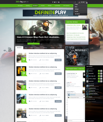
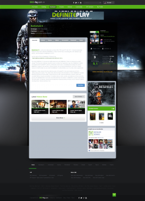
360_HQ_2013_PSD_Design_Homepage.jpg
Description:
360-HQ Homepage 2013 - new look coming soon.. leave your feedback.. 80% complete design.
Filesize:
2.38 MB
Viewed:
3264 Time(s)
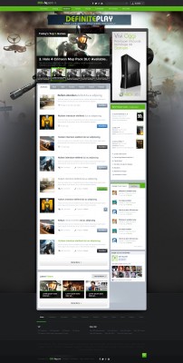
360-hq-2013-games-mockup.png
Description:
first games mockup!
Filesize:
2.36 MB
Viewed:
3728 Time(s)
20130203_360-hq.com-Homepage_skin2013.png
Description:
This is a homepage snapshot, the quality is nothing like what it should be but will give you all a rough idea of what the homepage is shaping up like.
Filesize:
1.45 MB
Viewed:
3385 Time(s)
20130203_360-hq.com_Games-Overview_1920x1080.jpg
Description:
Games Overview screenshot [1920x1080 HD]. This is what it looks like at full resolution, you will also notice the search options and autocomplete.
Filesize:
766.69 KB
Viewed:
3363 Time(s)
20130203_360-hq.com_Videos-List_1920x1080.jpg
Description:
This is the videos page so far.
Filesize:
640.18 KB
Viewed:
3364 Time(s)
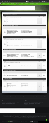
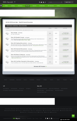
20130203_360-hq.com-Forums-Index_skin2013.png
Description:
This is a snapshot of the forums. Like before, it looks much nicer in full resolution.
Filesize:
432.25 KB
Viewed:
3361 Time(s)
20130203_360-hq.com-Forums-Cat-Index_skin2013.png
Description:
related forums can be now be shown on a seperate page, rather than just one huge forums index on the main forum page. I like it do you?
Last edited by forahobby on Tue May 14, 2013 10:53 am; edited 6 times in total
kennethk V.I.P. Lifetime
Joined: May 01, 2011 Posts: 1210
XP: 194,668
Posted: Sat Dec 29, 2012 4:57 pm Post subject:
I really like it it has that Xbox feel but not too bright or not too dark.
S1mme V.I.P. Lifetime
Joined: Jan 07, 2011 Posts: 782 Location: Sweden XP: 147,808
Posted: Sat Dec 29, 2012 9:21 pm Post subject:
It looks so... AWESOME _________________________________________________________ Just a random 19 year old kid from Sweden, no biggie right? -> HQS1mme.com
JBriZzeL V.I.P. Lifetime
Joined: Mar 26, 2006 Posts: 1386 Location: Gearsville,USA XP: 13,588
Posted: Sat Dec 29, 2012 9:24 pm Post subject:
Looks good Hobbs. I never wanted to be rude in the past, but I'm just saying that the site had WAY to much clutter/features. But now this new site design looks very well done. Keep it up and hope to see the new look in '13.
Joined: Jan 31, 2004 Posts: 1769 Location: NH, USA XP: 171,140
Posted: Sun Dec 30, 2012 1:57 am Post subject:
The new design is looking to be a STRIKE! In bowling that is hehe. I think it will be great for new visitors as it has a clean and easy to use look to it. I cant wait!!! _________________________________________________________ 10% VIP Discount (Coupon Code: HQ-VIP-001 ) - Signup for web hosting at www.TweakedHosting.com/clients/aff.php?aff=004 and earn the HQ network of sites recurring income!
forahobby Administrator
Joined: May 22, 2003 Posts: 23948 Location: NSW, Australia XP: 3,060,914
Posted: Mon Dec 31, 2012 3:02 pm Post subject:
tweaked wrote:
The new design is looking to be a STRIKE! In bowling that is hehe. I think it will be great for new visitors as it has a clean and easy to use look to it. I cant wait!!!
thanks for the feedback so far everyone.. It's been great and can only get better with everyone's comments.
Here is our first mockup of the games, news, images, achievements pages etc.. I still have to work on tutorials, homebrew and all our additional areas like downloads.
Once i get a basic layout done for a few pages i can then just recode those pages over and over and tweak them for each area..
The forums is going to be a big big job.
Enjoy the latest attachment and check the first post in this thread as well!
Joined: Feb 07, 2005 Posts: 2743 Location: Florida XP: 14,186
Posted: Mon Dec 31, 2012 4:01 pm Post subject:
Love it! I like the way everything looks separated and the way the dates stand out. Looks easier to navigate too. Great job _________________________________________________________
X_Splinter Moderator
Joined: Jul 03, 2004 Posts: 2385 Location: Portugal XP: 368,740
Posted: Mon Dec 31, 2012 4:03 pm Post subject:
I really like those beta previews mate.
I believe it's in the right track, HQ really needs a facelift like that.
Kept up the good work and kept us updated _________________________________________________________
You cannot post new topics in this forum You cannot reply to topics in this forum You cannot edit your posts in this forum You cannot delete your posts in this forum You cannot vote in polls in this forum You cannot attach files in this forum You can download files in this forum